Hannah Nations’ Graphics Portfolio
My Graphics Work
This page compiles all of my graphic design work throughout my years at Clemson University. These projects were not necessarily my starting point in graphics, as I was given the opportunity to take graphics courses in high school. With these pieces you will see a combination of skills demonstrated through Adobe softwares such as Illustrator, Photoshop, and InDesign. I learned a lot creating these works and had fun doing it.
Menu Project

Menu Front

Menu Back
The purpose of this project was to design a menu for a restaurant of our choice. I decided to do a brunch restaurant because I love breakfast foods. For the front of the menu I wanted to have an organized layout that also gathered the viewers attention. I thought a swirly font style for the section titles would add a sophisticated look while not being too busy. I added photos in circles that way I could add detail to the menu as well as have something that popped of the page. I differentiated the menu items and description by using a red color for menu items and black for their description. The bottom right corner background of the menu is brown with coffee beans. I thought this would tie in well with the brunch theme and add detail so it didn’t seem as flat. The back of the menu follows this theme with the brown coffee beans as well as a logo placed in the center. I had so much fun designing this piece and pretending like I owned my own brunch restaurant.
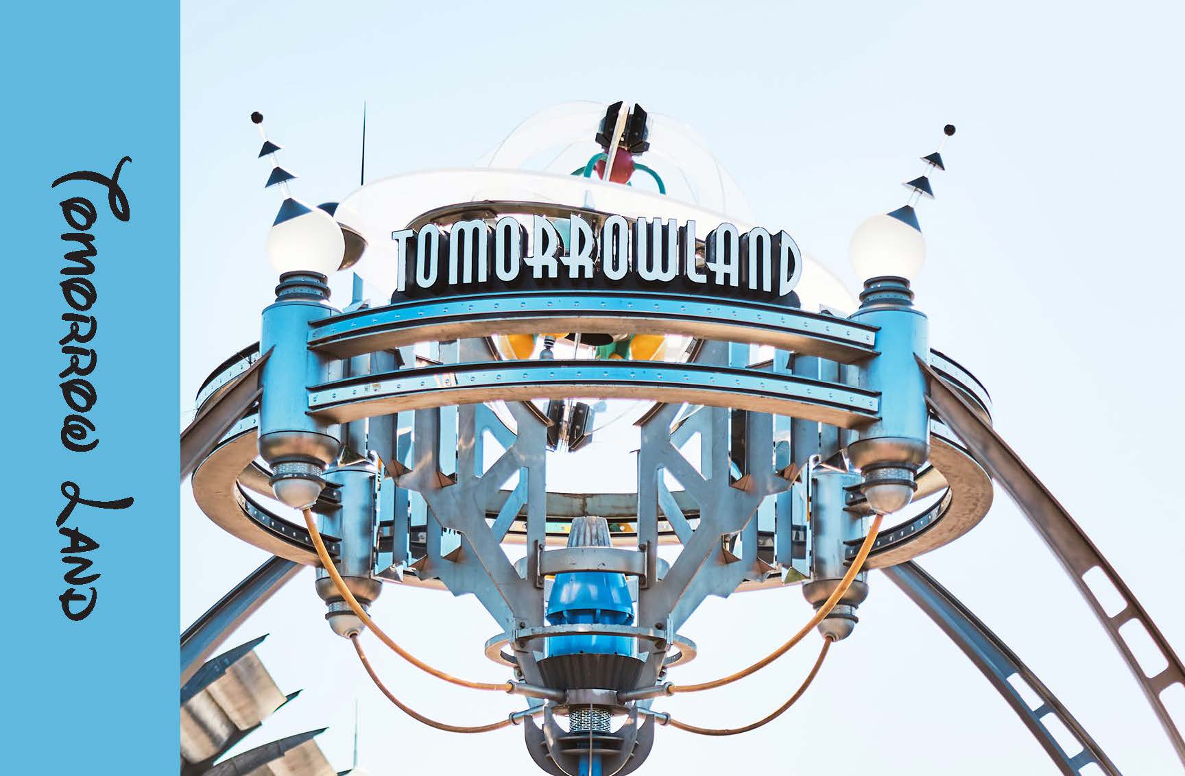
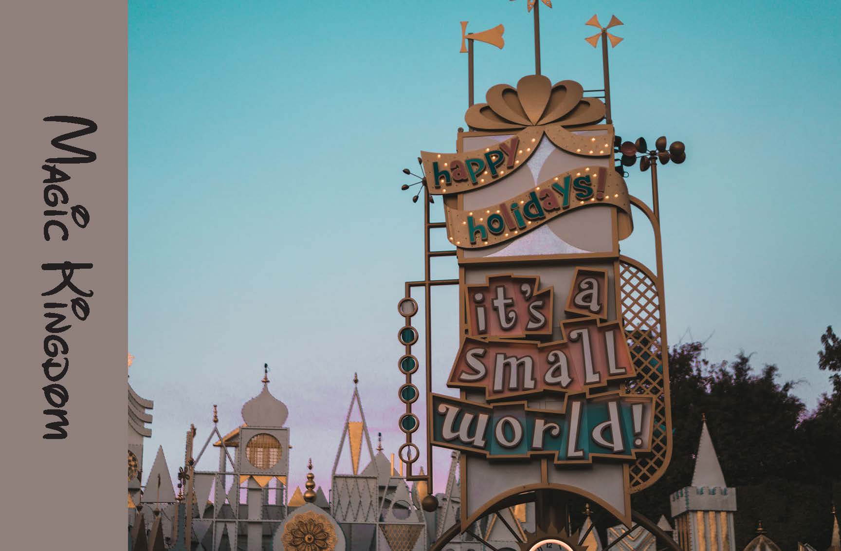
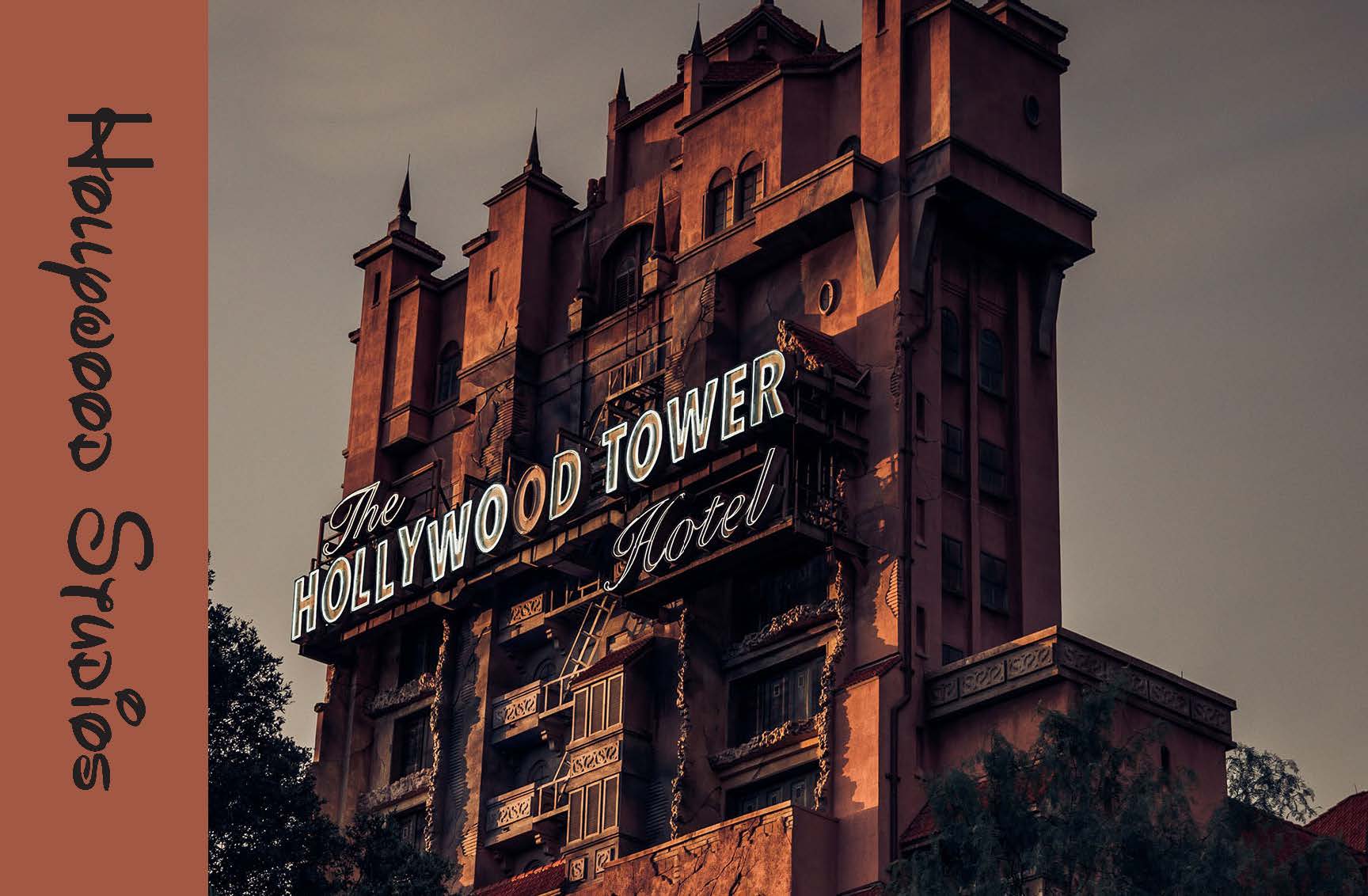
Postcard Project
Tomorrowland Front
Tomorrowland Back
Magic Kingdom Front

Magic Kingdom Back
Hollywood Studios Front
Hollywood Studios Back
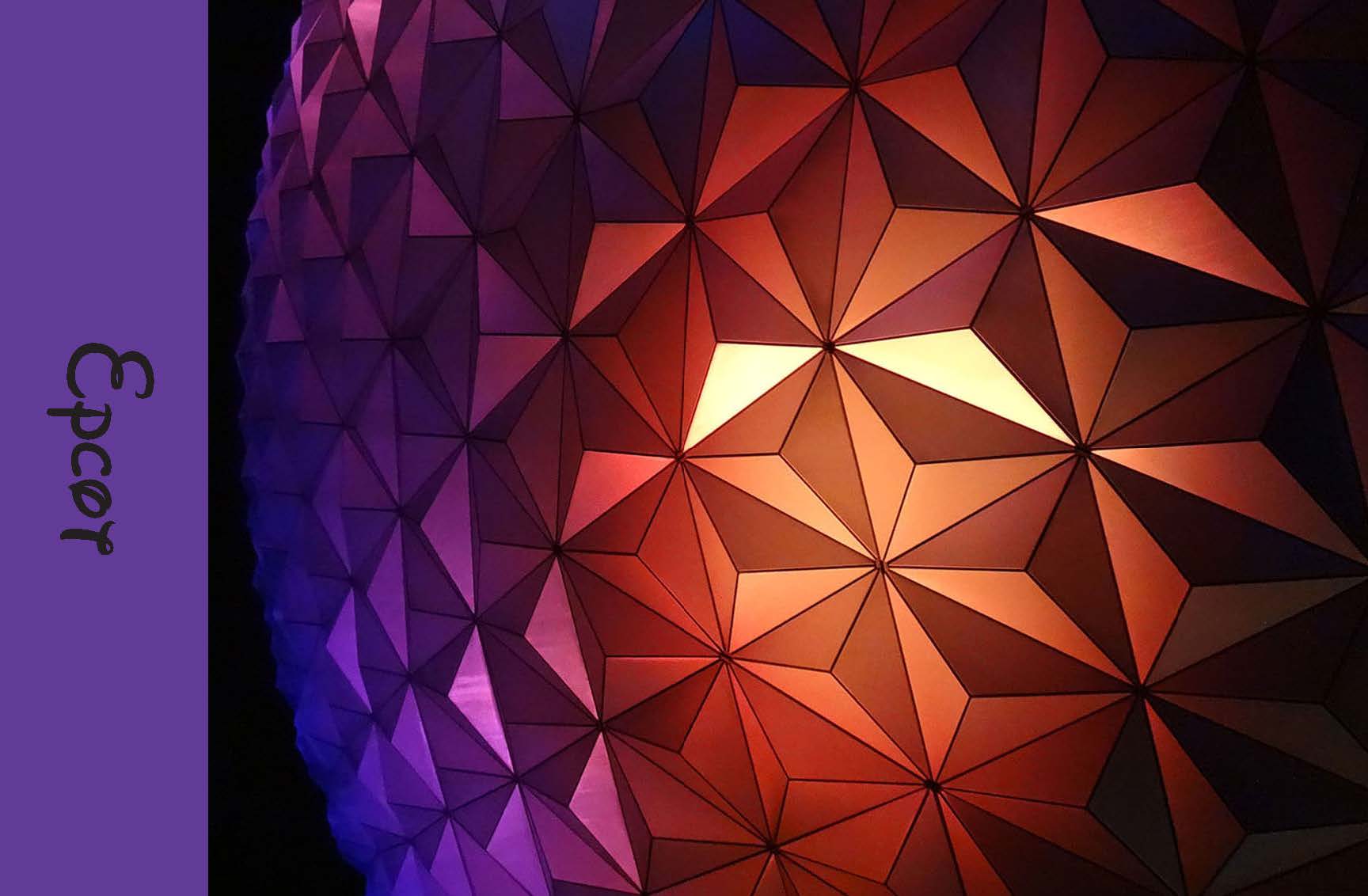
Epcot Front
Epcot Back
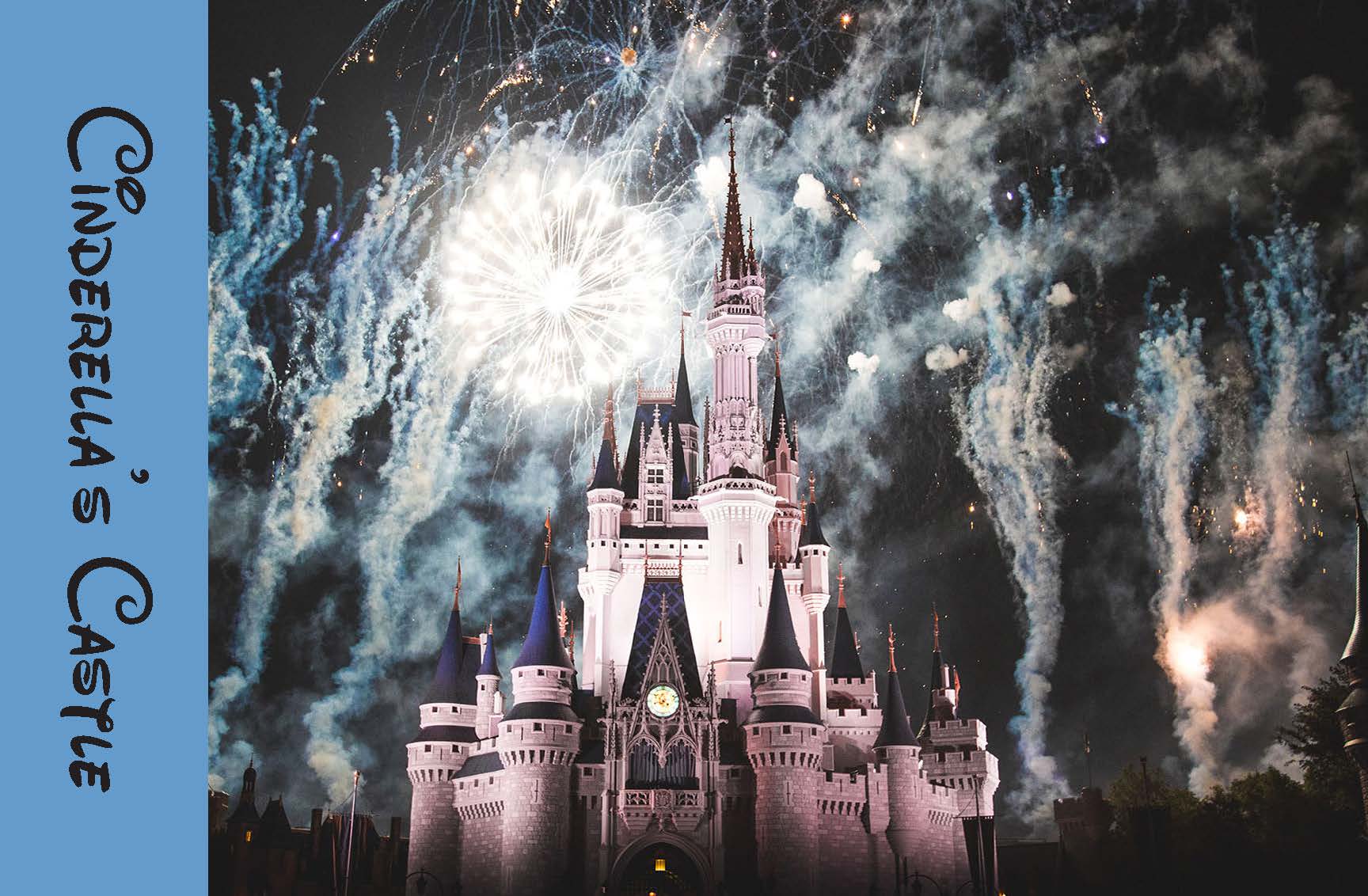
Cinderella’s Castle Front

Cinderella’s Castle Back
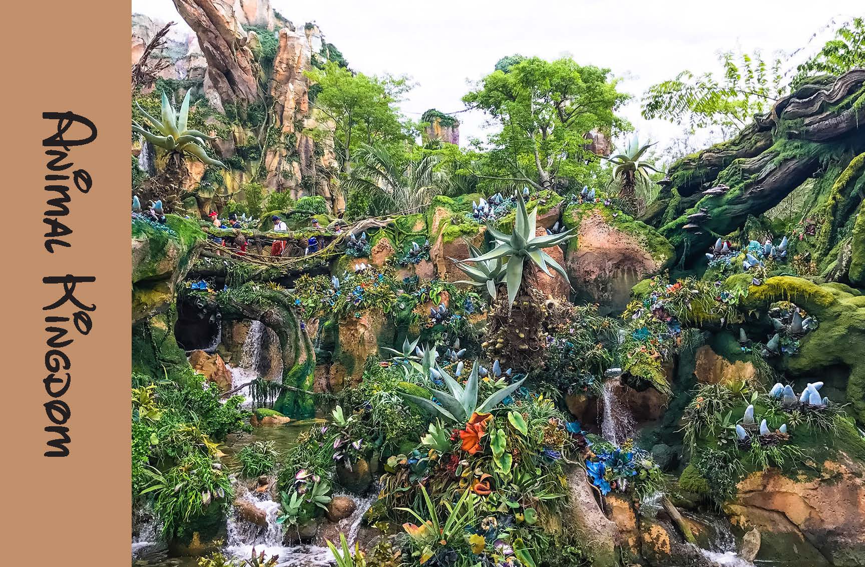
Animal Kingdom Front
Animal Kingdom Back
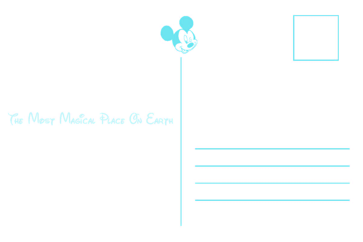
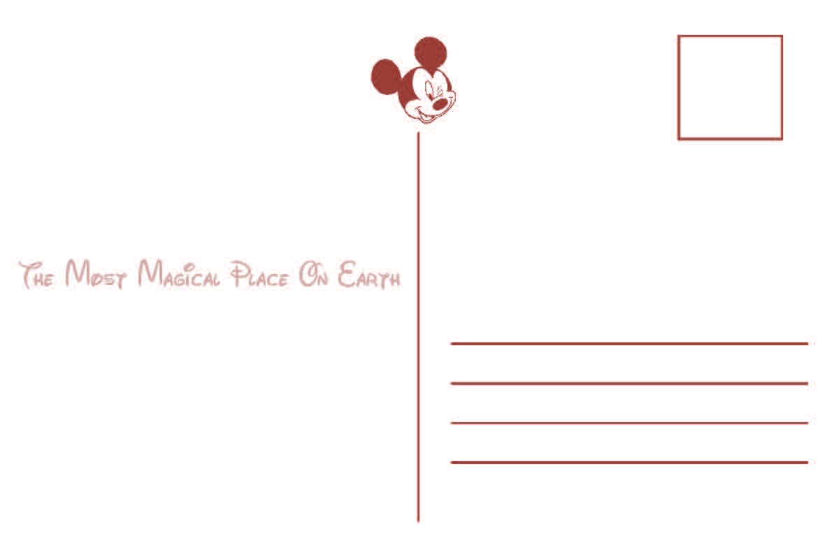
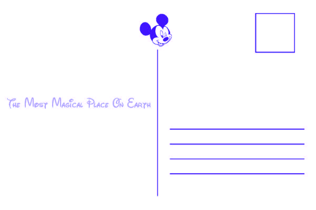
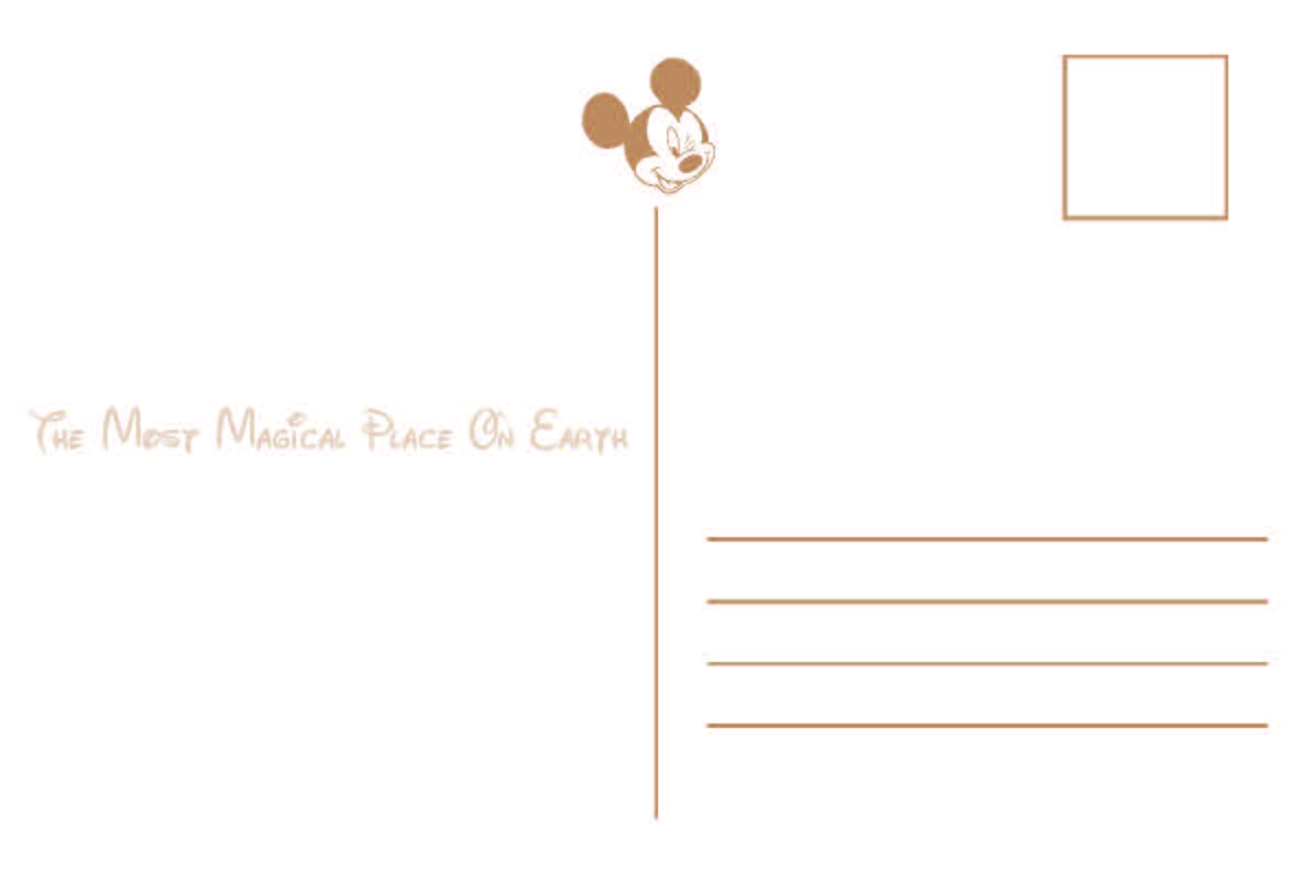
The purpose of this project was to design a series of postcards. The theme for my set was Disney. We used VDP for this project which is a form of digital printing where anything from images to text can be changed between pieces. Postcard designs usually include an image and some form of short text including a location or some sort of short saying. I decided that since my text may be hard to read overlaid on the photos directly, I should add a solid color bar to a section of the front of the card. Each color bar corresponds to the theme of the photo. Each title is either the Disney park name or landmark where the photo is located. For the back of the postcard I added a Mickey Mouse to the top of the section separator as well as the slogan “the most magical place on earth” to the left of the back of the card. The slogan is semi-transparent so that a letter could still be written over top of it. To the right of the back of the card I added lines where an address could be added and a square where the stamp would go. It was quite a process discovering the capabilities of VDP and this project was a great way to learn. This is a project that I have much pride in as I think the design is simple but also very cute and something I could envision being sold in real life.
Flexography Project
Clemson Stickers Dieline
This project was my first flexography project. The idea was to make a 1-color Clemson design. For this project I wanted to create four different designs rather than just one so I was able to play around with compensation levels (explained further in the next project). This was the first project that I did where I was actually able to run a press. The whole process of flexography is a really intricate and fascinating thing. I had no idea that there would be so many steps involved in creating a sticker but I am so grateful that I got the opportunity to learn.
2-Color Flexography Project

Design

Dielines
This project was a flexography sticker project where students had the freedom to create their own design. I struggled with this project because i wasn’t sure exactly what I wanted to do with it. It took me a while to pick a design I really loved. As you can see I have both the original design and the dieline showing and the colors look quite different. This is because in order to actually print these stickers I had to do something called compensating. This is when you take your colors and change them so that when you print they will come out the shade you want them to be. Of course we got to run the ink colors we wanted, but with flexography you have to create plates that your design is extruding from. When you compensate, this takes the color from a solid (where that section would be solid on your plate, and changes it to having it made up of a certain size dot. This way ink gets applied to the substrate differently and can change the saturation of your ink color, making it seemingly change in color. This project taught me so much about making films, plates, and running a flexo press.
2-Color Screen Printing Project
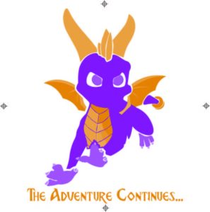
Screen Printing Design
The purpose of this project was to create a 2-color screen printing design. I decided to do a game character named Spyro for mine. For this design I decided to go with the purple and gold colors of the character with a gold text. The font I chose was very similar to the font used in the game. I had to do a lot of compensation for this design being that I was creating a whole character and I didn’t want much white space between elements of his body. During screen printing I learned about making screens and one mistake I made was not washing my registration marks out all the way. I realized this when I was doing my test-prints. It was a relatively easy fix but could have been much worse if my design were closer to the registration marks or if I didn’t wash out a part of my design. I also learned about the belt dryer and how careful you have to be when placing things inside to ensure that they do not get stuck or catch on fire. My favorite thing I learned, though, was which direction I liked to squeegee in. There are two methods, pull and push. I found that when I would push the ink I would get a much cleaner outcome than using the pull method. I was very proud of this project and I still wear the Spyro shirt I screen printed to this day.
email address: hannahnations14@gmail.com
Site by Hannah Nations